Monday I received my Cocoa Daisy kit
Hooray!!
So much to love in this kit (and the add ons)
It’s now Friday and I can share 3 of the 4 pages I have made
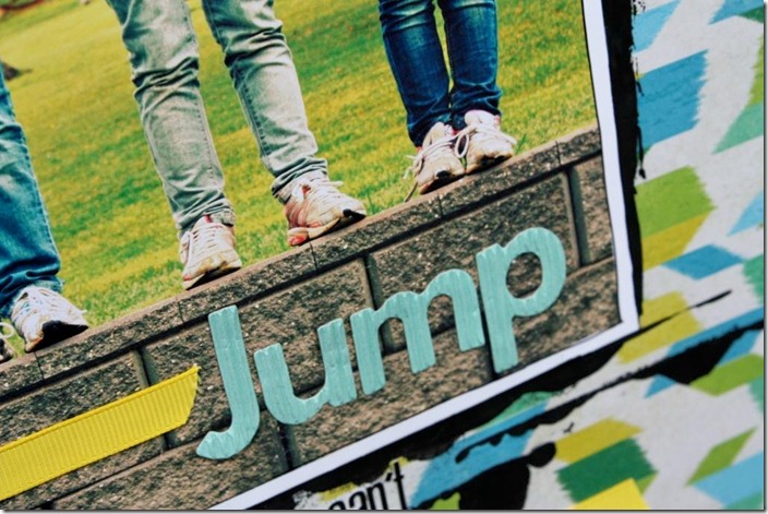
This Crate “Sensation” pattern paper matched my photo perfectly
and I layered up some of the exclusive Ormolu dots and flair
even the American Crafts Thickers (Hugs robin's egg blue) worked perfectly with my photo
as did the Lily Bee alpha stickers (found in the “Now Showing” add on)
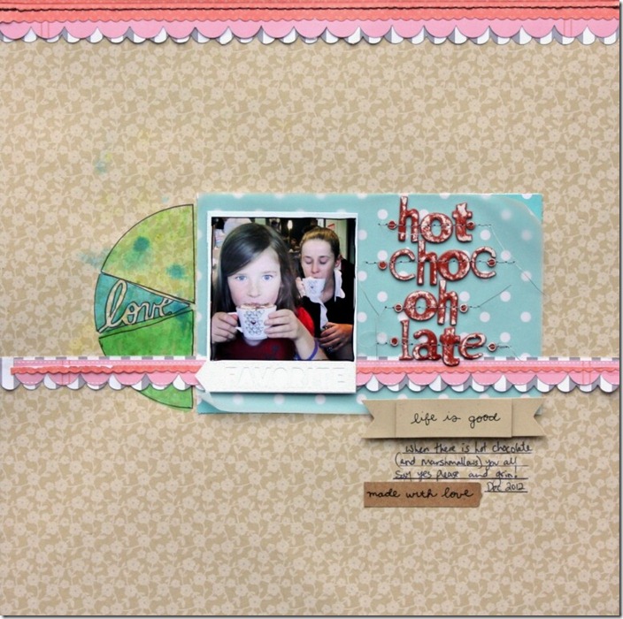
Next up was the Pebbles “Walnut Grove Carrie” paper
I love that it’s Kraft (so had to use it!)
I cut one of the KI border stickers (found in the “Starring Role” Add on)
Used the stitched part along the top of the page
and then used the leftovers under the photo
added some vellum, to “dilute” the pattern paper
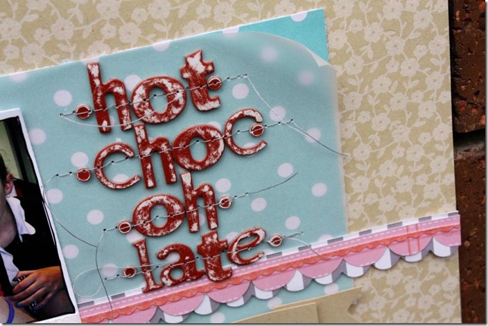
Distressed the alphas (from “Now Showing”)
and I played with Ronda’s just released Crafter’s Workshop “Pie Stencil” (found in the "Double Feature” kit)
I used the Faber Castell pens
That I used in this post
I coloured in each section
Sprayed it with some water
added some spots of mist
Dried it
then added the black outline
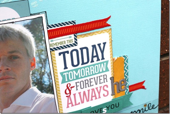
I also played with the “Layered Stars” stencil
heat embossing some “Powder” embossing powder
for a tone on tone effect
I then layered pieces to say what I wanted to say
adding to the message where needed
Seriously love this months kits
What about you?
Anything grab your eye??
What pieces would you use straight away??


I LOVE these Sharmaine!!! So clean, simple and SO innovative. I'm always looking for small details that will add punch to a photo and I love the idea of the ribbon in the photo and the powder on light blue cardstock is fabulous!!! The black paint looks AMAZING on that page!! The colors you've used in each page work beautifully together. That's one of my main focuses for improvement this year- learning to combine color in ratios that will make my page pop. Thanks for this mini lesson!
ReplyDeleteYou're amazing! A fabulous set of layouts, but I think my favourite is the Hot Choc-oh-late one! So clever you are :-)
ReplyDelete